Three frontend stacks, no shared code and no authority to choose one.
3M’s software portfolio grew through acquisitions over several decades. The codebases stayed separate, and third-party vendor teams maintained them under different tooling and contract scopes.
I audited 24 collaborators across 11 departments in SIBG, Corporate IT and Scott Fire & Safety. Production applications ran on three main frontend frameworks: Angular (Material v16), React (Material UI v7 and Base UI) and .NET.
There was no centralized code to build from, so engineers approximated Figma designs by restyling third-party UI kits such as Bootstrap, Kendo and Material. That produced three recurring problems:
- Visual differences between the design file and the shipped screen.
- Accessibility defects that each team fixed on its own.
- Long design review cycles to catch both.
The design team was small and had no corporate authority to require a tool from contract teams. A single proprietary component library could not succeed under those conditions.
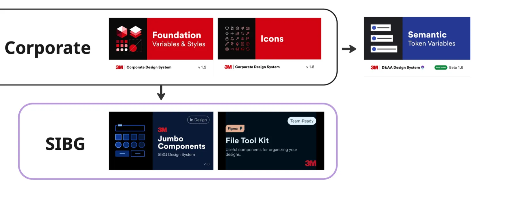
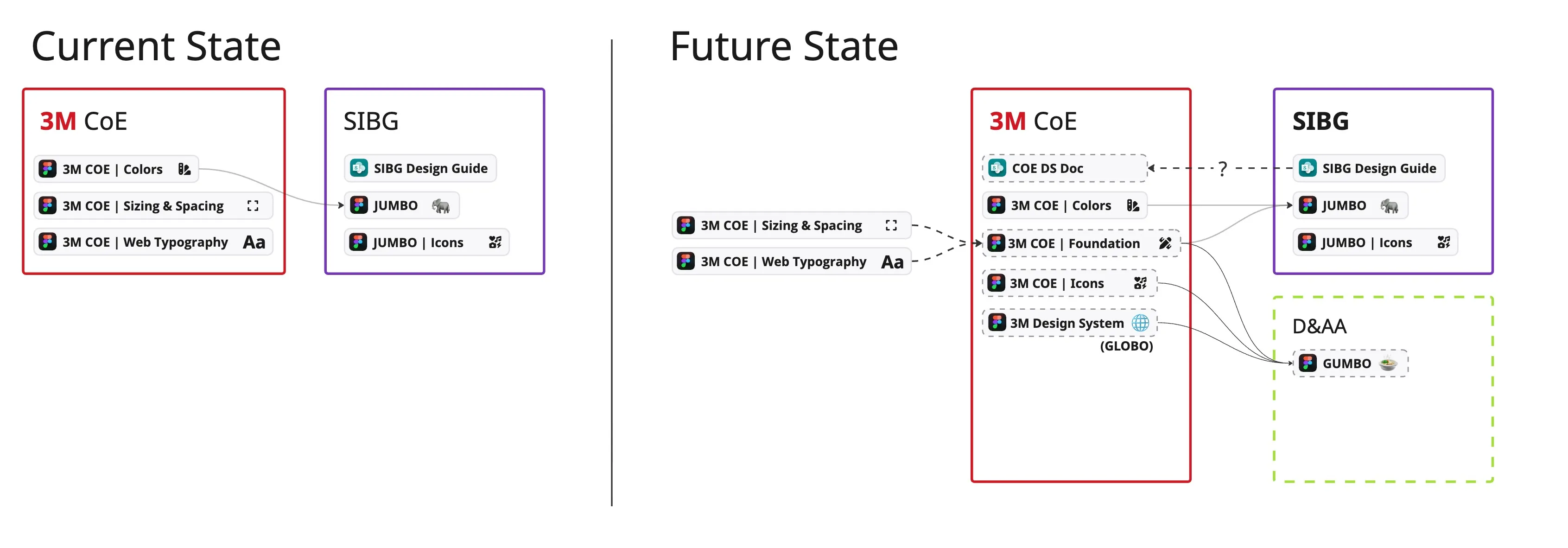
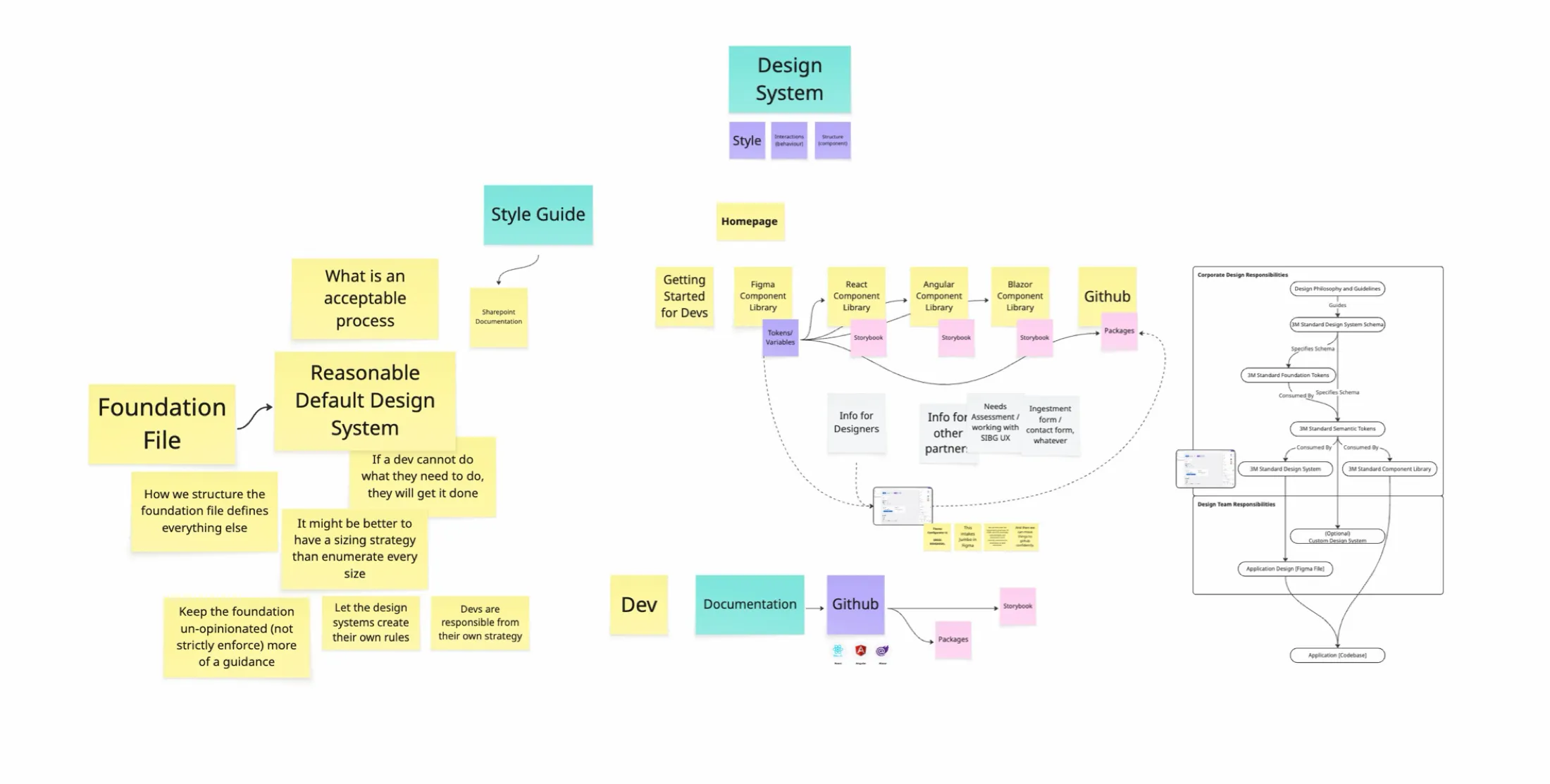
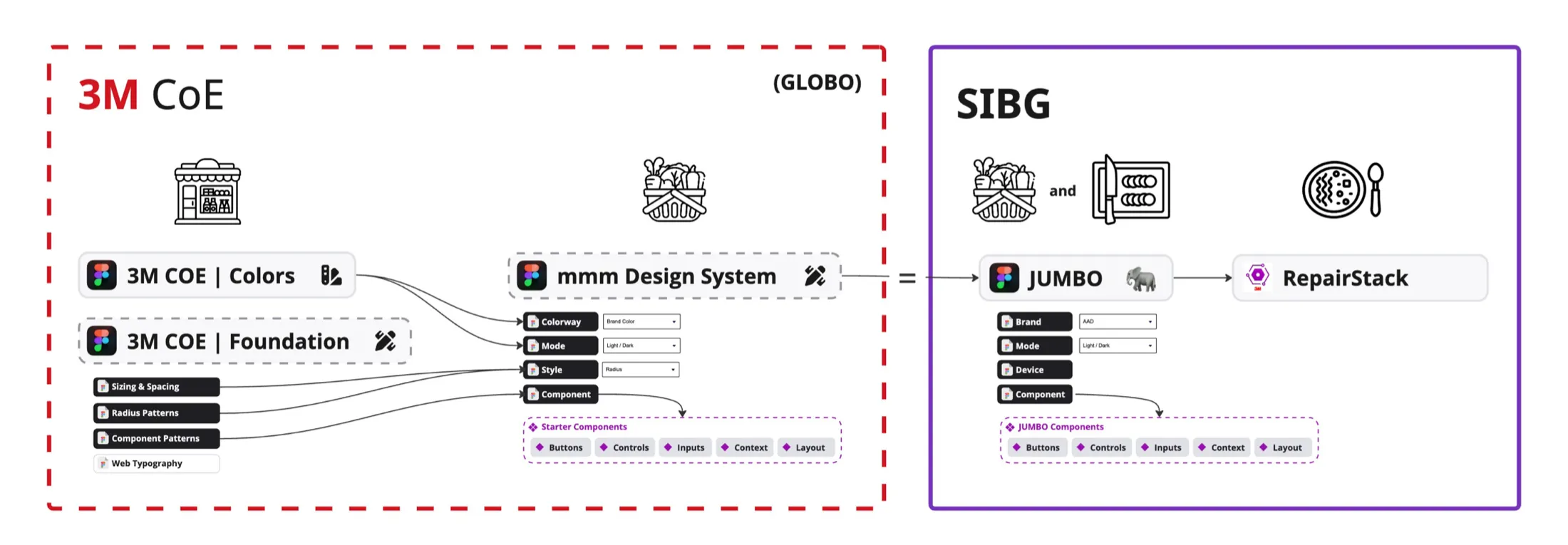
The design files were fragmented in the same way. Corporate kept colors, sizing and spacing, and web typography in three separate Figma files. SIBG kept a SharePoint design guide, a JUMBO component file and a JUMBO icon file. My early strategy diagram proposed one Corporate Foundation file that SIBG’s component library inherits from.
Typed tokens and reference implementations on the libraries teams already ran.
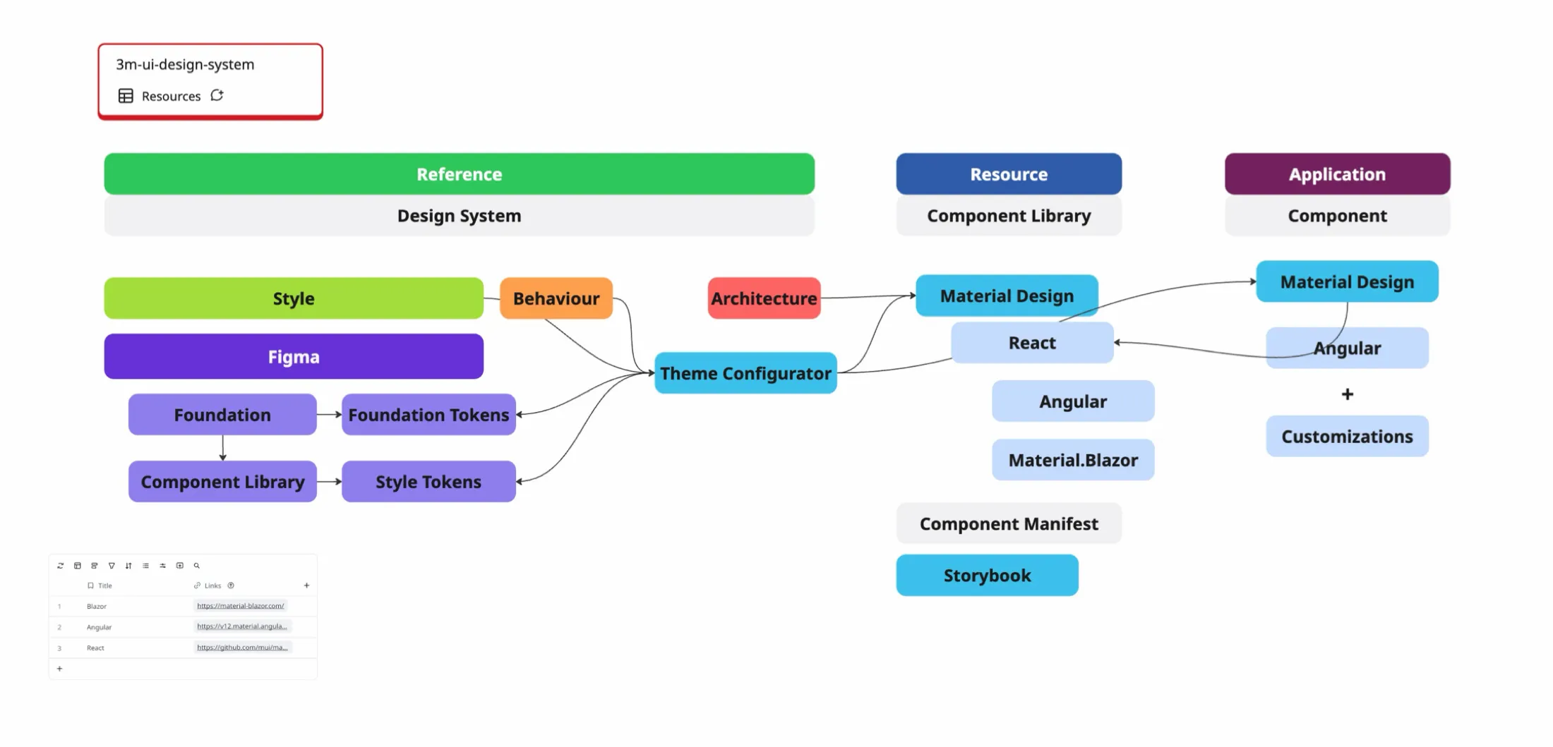
I replaced the component-library plan with an automated token pipeline. Teams keep Angular Material, MUI or Material.Blazor and add tokens and theme configuration on top.
Foundation tokens hold color ramps, spacing and type scales. Semantic tokens map those values to brand and context roles.
One build writes CSS custom properties, SCSS variables, JSON with TypeScript declarations, C# constants and WPF XAML dictionaries.
@3m-cloud/3m-foundation-tokens and @3m-cloud/sibg-jumbo-tokens, published to the company’s GitHub Packages registry.
Reference configurations for Angular Material, MUI for React and Material.Blazor, plus a Theme Configurator that renders in plain HTML and CSS.
The pipeline runs without manual steps:
- A contract check calls the Figma REST API and confirms the variable collections and modes the build depends on still exist.
- A fetch script reads the variables, resolves aliases and writes one token file per brand, device and color mode.
- Style Dictionary compiles each file into the platform outputs.
- GitHub Actions publishes the package to GitHub Packages. The workflow runs on every push to
main, daily at 06:00 UTC and on demand.
Developers get IDE autocomplete and compile-time type checks on token names. They no longer open Figma to find a value or convert hex codes to rems by hand. The foundation library and the component library are both Figma files with variables, so designers and developers read from the same names. The Foundation library and the JUMBO Components library require 3M access.
Resolving one component across brands, themes and devices
The demo below uses the resolved token sets from the JUMBO monorepo. Switch the brand, theme or device and the card re-renders from the values in the table. Rows that changed from your last selection are highlighted. Corner radius, field height and button height vary by brand and device as well as color.
Your edits apply to every brand that inherits this component.
--jumbo-primaryrgb(52, 115, 222)--jumbo-accentrgb(150, 87, 217)--jumbo-primary-textrgb(255, 255, 255)--jumbo-textrgb(32, 32, 36)--jumbo-text-mutedrgb(88, 88, 95)--jumbo-borderrgb(203, 203, 212)--jumbo-hoverrgb(232, 243, 255)--jumbo-input-bgrgb(255, 255, 255)--jumbo-card-bgrgb(255, 255, 255)--jumbo-primary-hoverrgb(23, 81, 194)--jumbo-primary-pressrgb(10, 56, 154)--jumbo-background-layer-0rgb(242, 242, 245)--jumbo-radius2px--jumbo-card-radius4px--jumbo-button-radius2px--jumbo-button-height40px--jumbo-button-font16px--jumbo-field-height40px--jumbo-field-font16pxtokens.json in the JUMBO repository. Four of the five brand presets are shown. EMD matches SIBG for these tokens.Visual QA without a framework
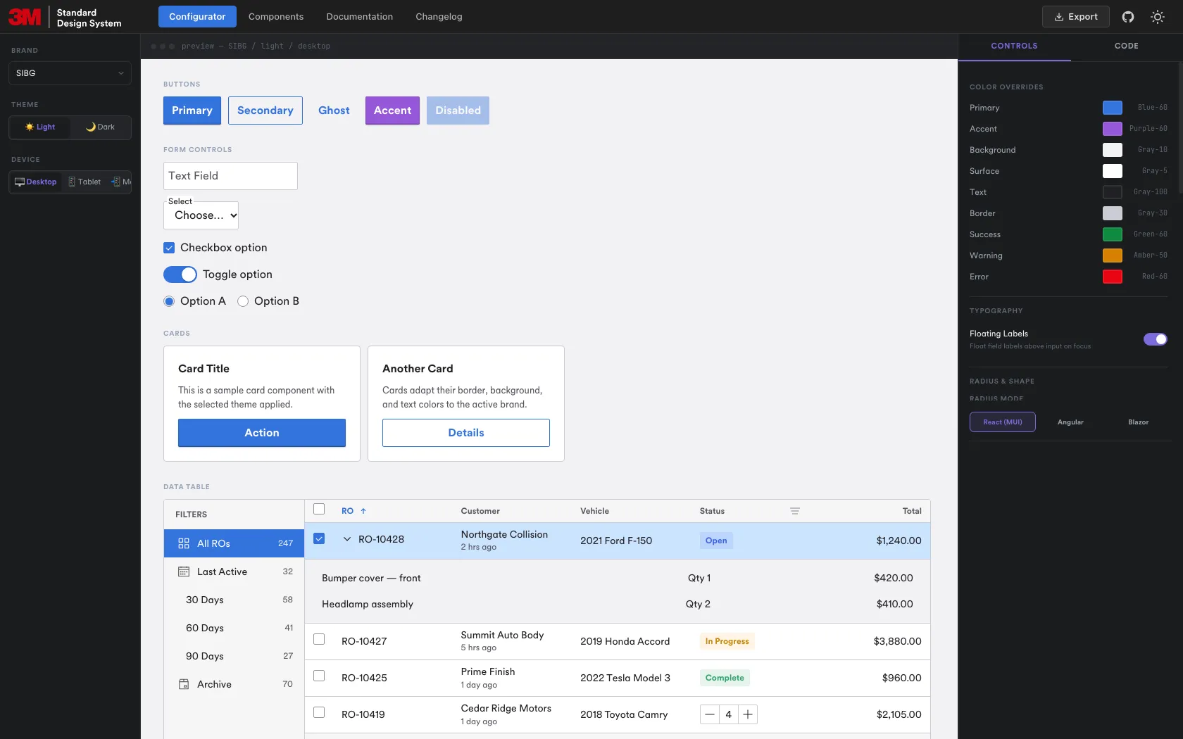
The Theme Configurator is the design team’s staging area. It renders every component in HTML and CSS, so we can check a theme without depending on any one framework’s rendering. It also exports theme code for each supported framework.
Developers asked for values to apply, not components to install.
The original plan was a library of pre-built components. Interviews with engineering leads changed it.
| The plan | What I found |
|---|---|
| Ship an opinionated component library. | Teams rejected it. Custom state management, accessibility requirements and framework version differences made external components hard to integrate. Engineers asked for component-level tokens and styling values they could apply to their own components. |
| Support React, Angular, .NET and plain HTML. | The design team did not have the engineering headcount to build, test and maintain four component libraries. |
What the audit recorded
The audit sheet listed each collaborator’s department, familiarity with the system, codebase and UI kit. Eighteen of the 24 did not record a stack. The six who did:
| Framework | Count | UI kit recorded |
|---|---|---|
| Angular | 3 | Material v16 for one engineer, “Material” for the other two |
| React | 2 | Material UI v7 for one engineer, Base UI with Tailwind for the other |
| .NET | 1 | None recorded |
| Not recorded | 18 | Not applicable |
My notes from the prioritization session reached the same conclusion from the other direction. If the system blocks a developer, the developer works around it. So the foundation should be guidance, not strict enforcement, and each team should be able to add its own rules on top. The sizing note asked whether to define a sizing strategy instead of listing every size.
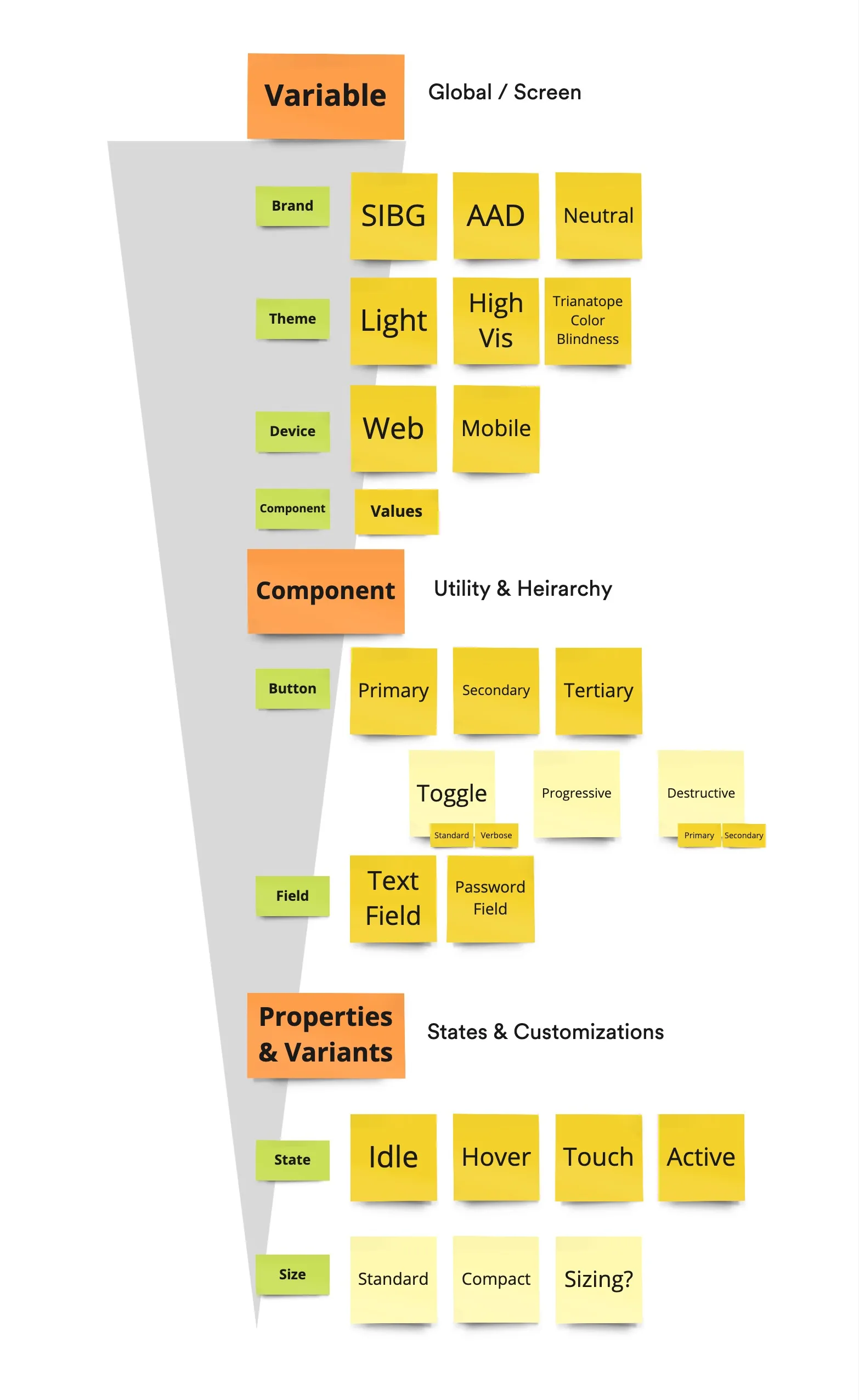
I organized the variables by how much each one changes: global variables first (brand, theme, device), then component values, then states and sizes. The open “Sizing?” note beside Standard and Compact in Figure 3.1 is the sizing question above.
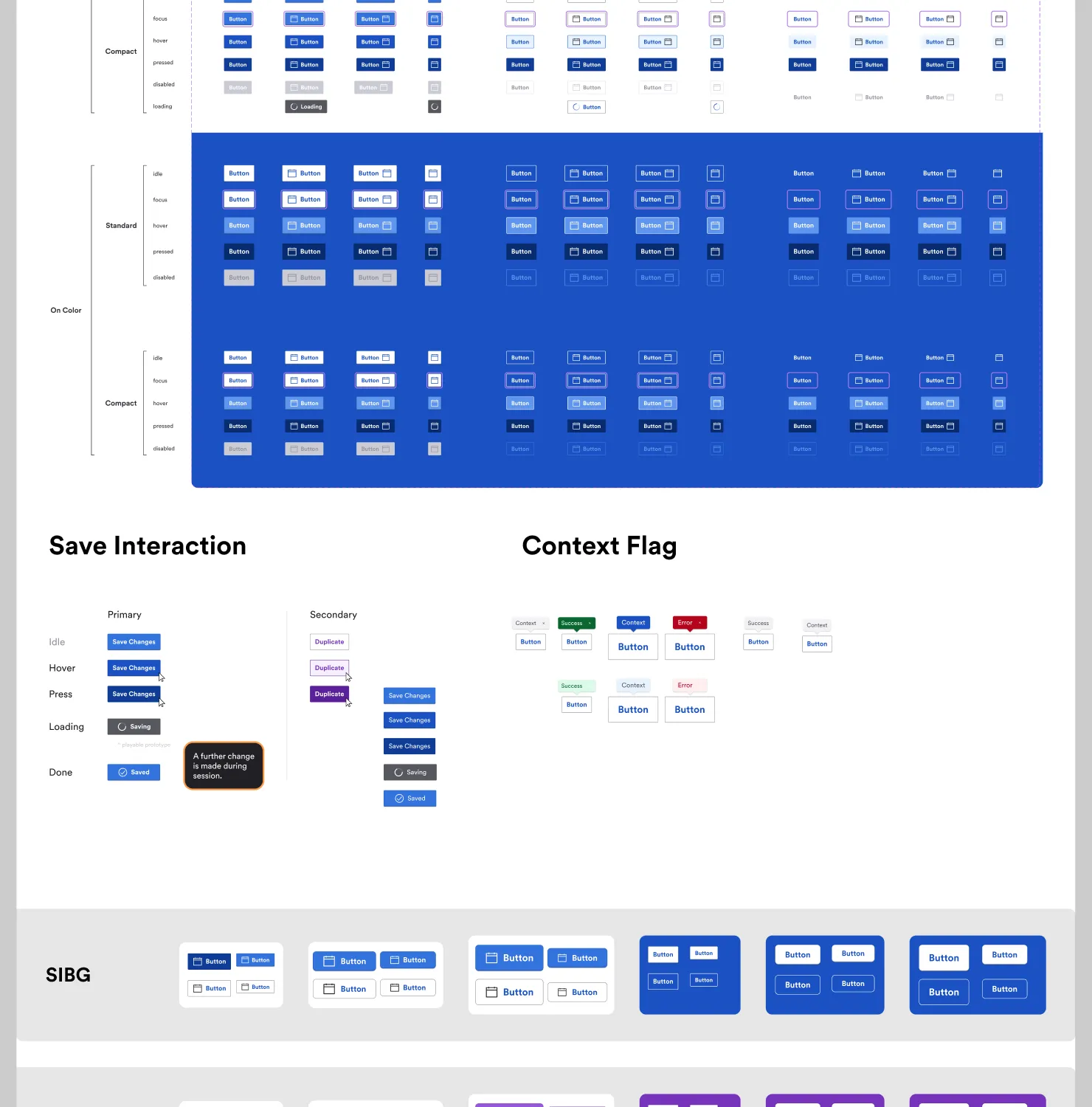
The JUMBO Components library applies that hierarchy. Each button is defined for Standard and Compact sizes across idle, focus, hover, pressed, disabled and loading states, on neutral and on brand-colored backgrounds, with one row per brand.
Five decisions that shaped the system.
Decision 1: Two token tiers, with brand, device and color mode as variable modes
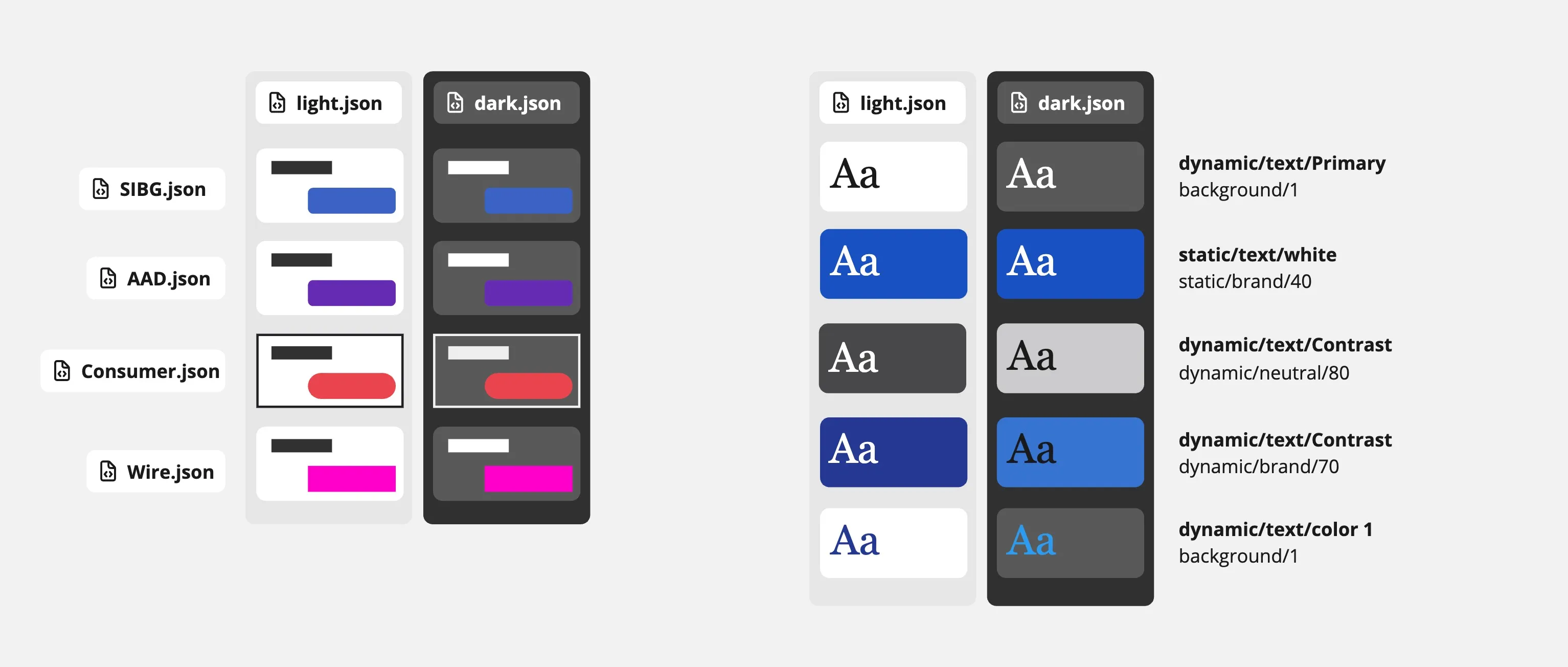
My first model was a chain of JSON files. A 3M palette file fed one file per brand (SIBG, AAD), which fed light and dark files, which fed a component file.
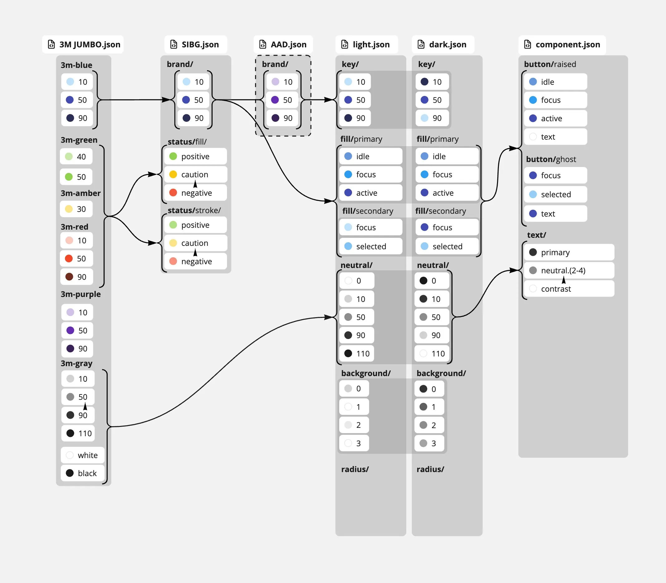
Dark mode exposed a gap in that chain. It did not say which values change between light and dark and which stay fixed. The next diagram pairs each text token with the surface it sits on. Dynamic tokens change with the mode. Static tokens, such as white text on a brand-40 fill, do not.
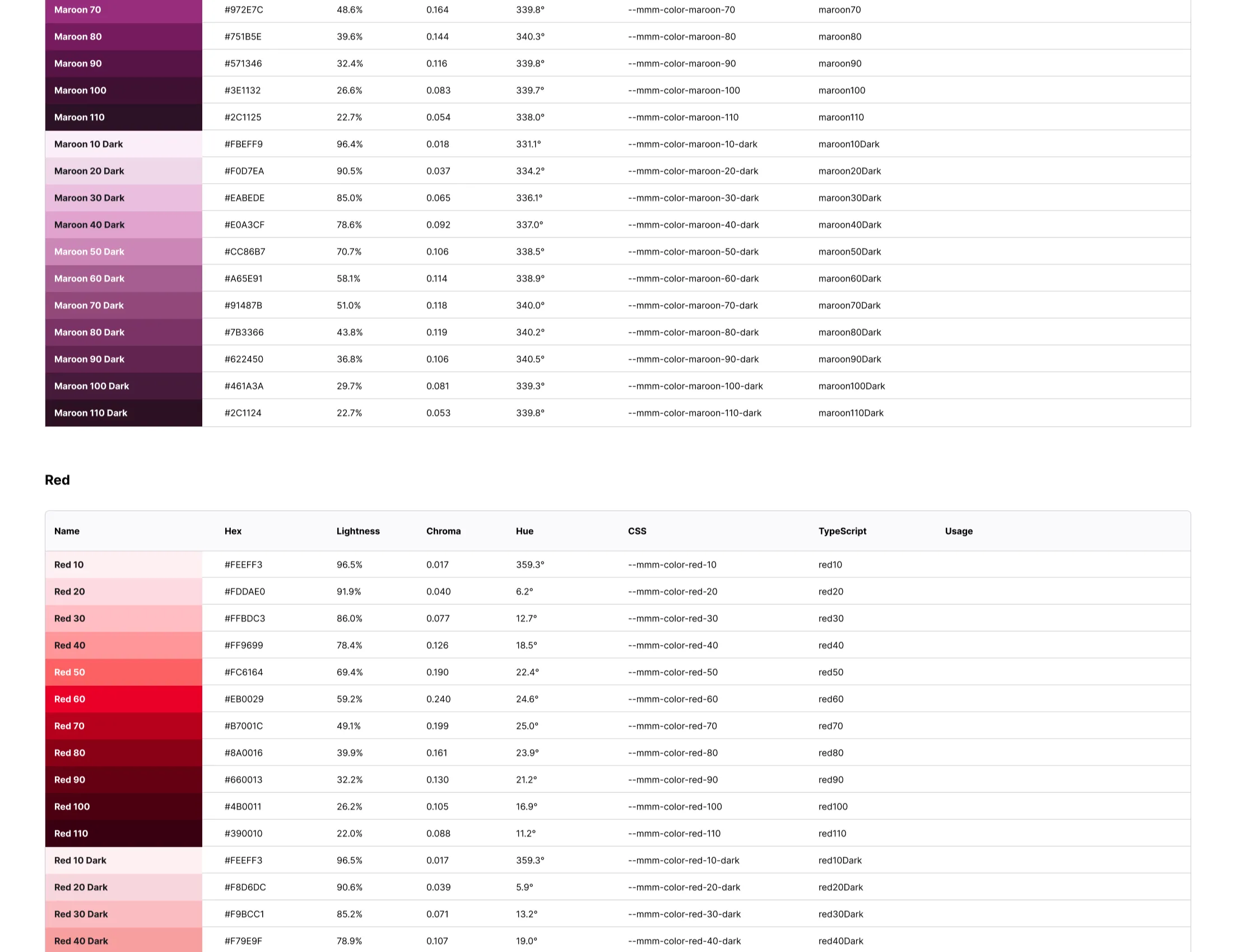
The shipped version uses Figma Variables in two tiers. Foundation tokens include color ramps with steps from 10 to 110 and a matching dark ramp. Each step lists hex, lightness, chroma, hue, a CSS name and a TypeScript name. —mmm-color-red-60 is #EB0029, for example.
Semantic token names follow one pattern: property, role, then emphasis. The properties are text, icon, border and bg. The roles are neutral, brand, accent, negative, warning, positive and alt. The emphasis levels are low-emphasis, emphasis, high-emphasis and press, so a developer can guess bg-brand-high-emphasis before looking it up. A -fixed-dark suffix marks the value meant for fixed dark surfaces. In light mode, text-default is #151518 and text-default-fixed-dark is #f2f2f5.
Brand, device and color mode are Figma variable modes. The build resolves one file per combination. In the SIBG package —layout-padding is 24 on desktop and 16 on mobile, and —button-height-standard is 40 on desktop and 44 on mobile. Each SIBG build contains 278 tokens.
Decision 2: Fail the build when Figma’s structure changes
Designers edit variables at any time, and the build locates modes by collection and mode name. A renamed mode would otherwise publish a package that silently lacks a device or a theme.
The contract check (npm run contract:check) calls /v1/files/:key/variables/local and fails if the payload is missing variable collections or contains zero variables. It also fails if the desktop or mobile device mode or the light or dark color mode is missing. A missing brand mode logs a warning. The fetch and build steps run only after the check passes.
Decision 3: Build on the Material libraries teams already used
The JUMBO monorepo (Nx with npm workspaces) turns Figma tokens into a framework-neutral core, then into three adapters:
@3m-cloud/jumbo-muiexportscreateJumboMuiTheme(), which returns an MUI v7 theme.@3m-cloud/jumbo-angulargenerates SCSS themes for Angular Material v12 and for v17 and later.Jumbo.MaterialBlazorprovides Razor components that wrap Material.Blazor v5.
The design system constitution gives engineers three ways in, and none is required. They can clone a model-home repository as a starter, copy a component or theme into an existing project, or build from the Theme Configurator’s CSS and HTML output and the Figma files. The design team owns the Figma libraries and the configurator. Engineering is invited to send pull requests to the model homes, so the system works like an internal open source project.
Decision 4: Contribute pull requests instead of handing off specifications
I joined a new monorepo that was rebuilding several acquired applications into one Angular codebase. Instead of writing specifications for the other engineers to implement, I opened component pull requests:
- Replaced custom HTML placeholder components with production components built on Angular Material.
- Installed the token packages and configured them to drive the Angular Material styling layer.
- Used the tokenized components in live application features alongside the core engineering team.
The difference shows up in a single rule. The first block is an illustrative example of hand-matching a Figma frame to a stock Angular Material color. The second uses token names and values from the published SIBG package.
// Before: values copied from a Figma frame
.save-button {
  background: #3f51b5;
  color: #fff;
  height: 36px;
  border-radius: 4px;
}
// After: values from @3m-cloud/sibg-jumbo-tokens
@use "@3m-cloud/sibg-jumbo-tokens/dist/sibg/desktop/light/scss/variables" as t;
.save-button {
background: t.$bg-brand-emphasis; // #3373e0
color: t.$text-on-color; // #ffffff
height: t.$button-height-standard * 1px; // 40
border-radius: t.$button-radius * 1px; // 2
}Decision 5: Write for AI coding assistants as well as for people
Engineers on these teams used AI coding assistants, and an assistant with no token source guesses values. I added a machine-readable component manifest (manifest.md) to the monorepo. It lists token names, component parameters and layout rules. Developers wrote custom agent skills that point at it, so their assistants read token variables from the npm packages and produced layouts that matched the brand without styling errors.
The JUMBO repository applies the same idea at larger scale. A generator produces these files, and no one edits them by hand:
MANIFEST.mdandllms.txtas entry points.components.json, which covers 30 components. Each entry lists the per-framework import, props with allowed values, the tokens used, do and don’t guidance and copy-paste recipes.tokens.json, with 30 resolved sets: 5 brands, 2 themes and 3 devices.- A 9-section
DESIGN.mdcontract for each brand. - An MCP server that serves the same data, and three agent skills for consuming the system, auditing a design against it and keeping the manifest current.
Two rules lead the consumption guide. Never hardcode a color, radius or size, and resolve each from a token. Match the brand’s look and feel, not only its values.
Concept-to-validation time dropped from three weeks to one afternoon.
With code-backed components, teams could explore layout variants, test edge cases and check internationalization strings in one sitting. Before, the same work took three weeks of design reviews.
- External development teams installed the packages without a mandate. Code completion reduced their ticket delivery time and eliminated visual rework during QA.
- One design systems architect supported several framework environments without maintaining parallel component libraries.
Status at departure
| State | Work |
|---|---|
| Shipped | The Figma-to-npm token pipeline for Foundation and Semantic tokens, and the Angular Material integration in the production monorepo. |
| In progress | Component-level token architecture was being explored. The React and .NET translations existed as architectural guides. |
| Ended | Active work stopped when 3M reorganized its engineering teams. |
What I learned
Matching the effort across stacks. The Blazor adapter wraps six Material.Blazor components, and the React and .NET translations were still architectural guides when I left, so those teams had less than the Angular teams.
Teams adopted the system when it removed work they already did by hand. A mandate was never available, so the tokens had to be easier to use than copying a hex value.
Finish the component-level token tier, then turn the React and .NET guides into reference implementations with the same depth as the Angular integration.